Hi everyone!
This is Torben, the game’s Art Director and Graphic Designer, and I would like to take you on a journey through the visual design process of NEON HOPE. I will show you how we found our unique art style and how current technology trends informed our vision of the future.

The Challenge
Compared to Dominik and Francesco I joined the project rather recently in January 2024. Having followed the game’s development at our local board game development events for over two years at that point.
Starting my work on the project I had two major challenges:
- Defining a graphic design style for layouts, icons and texts that fits the theme and mechanics, has a high clarity and readability, and enough flexibility for future changes and additions.
- Selecting an art style for the over 300 illustrations required and finding one or multiple artists that are capable of producing such a large amount of images in a consistent and reliable way – while staying within a budget that we could afford.
Furthermore, we wanted to distinguish NEON HOPE from other games of the same genre or in a similar setting. Therefore we were in need of a fresh approach while still offering something familiar for players to latch onto.
Design Style
While taking place in the future, NEON HOPE as a piece of science-fiction media is meant to be a reflection of today’s world. We wanted to project current trends into the future, aiming to comment on the present while putting an interesting spin on it.
At the same time we wanted to create an innovative setting mix of dystopian Cyberpunk with utopian Solarpunk in an attempt to explore a more hopeful and approachable version of the future. This proved somewhat difficult as the Cyberpunk setting is loaded with all kinds of expectations, tropes, and media coverage – especially the success of the Cyberpunk 2077 videogame has created a certain expectation for the aesthetics of the genre.
In order to establish our own take on the setting we set out to build it up from a different angle. Classic Cyberpunk has its roots primarily in the 80’s. Showing a dark future with highrise skyscrapers and dark alleys which are tinted in neon-lights from the ads overhead. Computers and other technical devices are blocky and shine in chrome. It is a world that clearly was inspired by how people back then imagined a dystopian future, where unstopped capitalism and violence ruled supreme.
So we asked ourselves: what would a Cyberpunk future based on the 2010’s and 2020’s look like? A technological era defined by the mobile internet, smartphones and minimalist technology. With corporations hiding behind colorful logos, bright facades, and their lofty claims for a better world.
The visual design of the game’s cards is our attempt to answer that question. Taking inspiration from contemporary app and web layouts with graphical shapes, minimalist layouts and playful icons. This has the added benefit of high readability and clarity. Unobstructed by embellishments this gives the game a very modern feel.
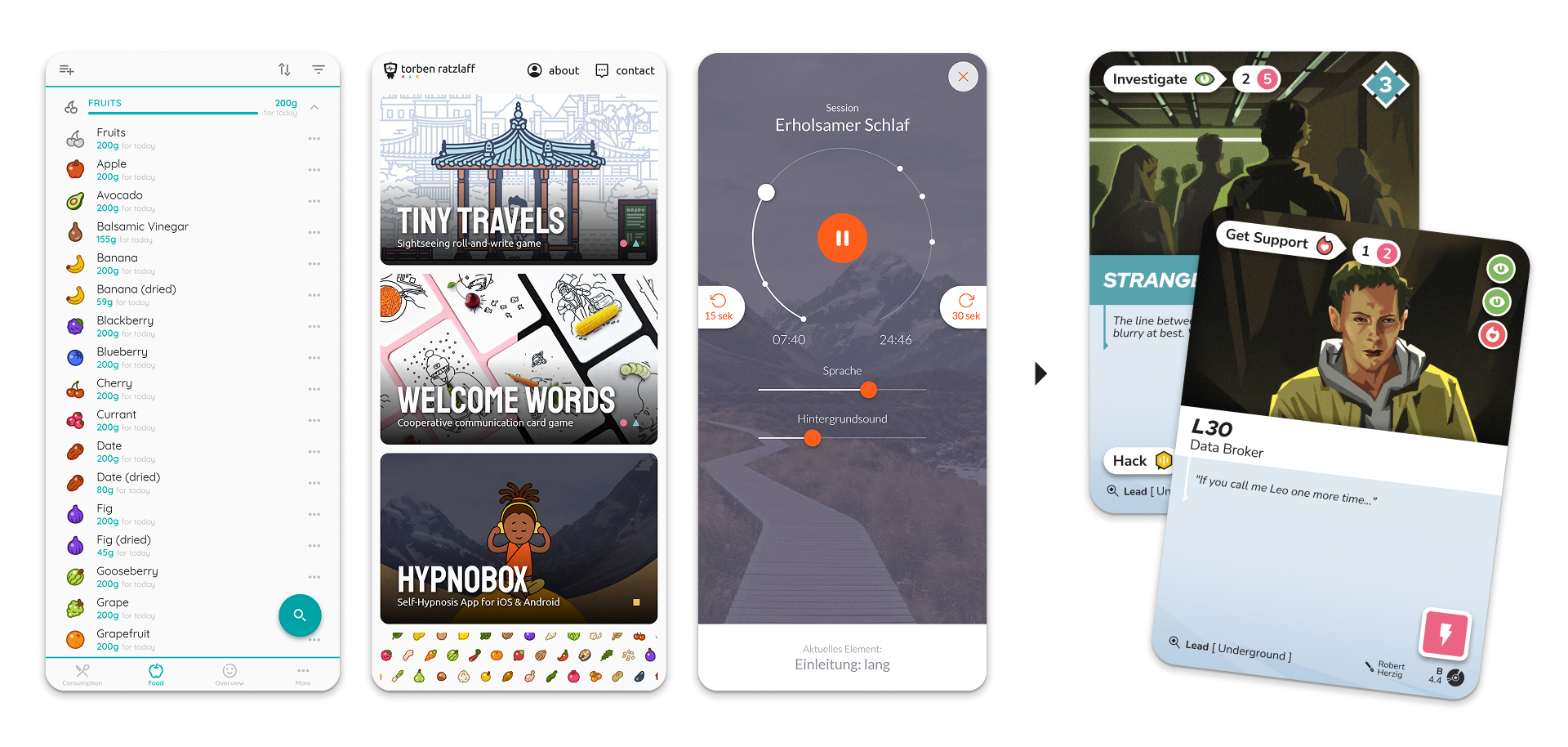
This also strengthens the idea that the card’s graphical elements are indeed a user interface. One which overlays and thereby creates the impression of an augmented reality. How we as players perceive the world is unavoidably shaped by the lens through which we perceive it.
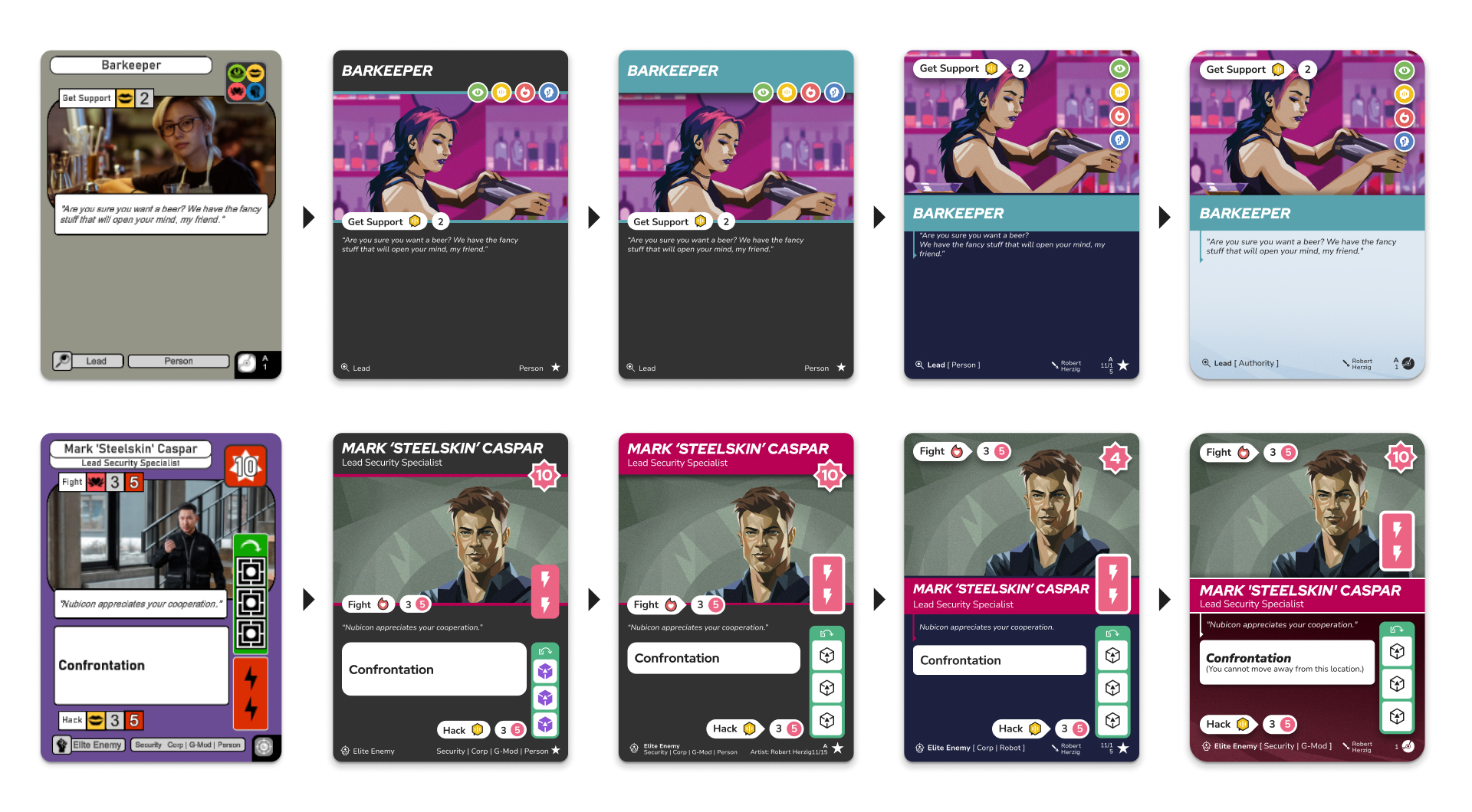
In terms of actual layouting the game’s cards were already in a pretty good state when I joined the project. The limited space available on each card acts as a moderator for each card’s complexity: If it does not fit on the card it won’t fit in the game. I primarily streamlined existing elements, adjusted their arrangement, and tried to give the illustrations as much space as possible.
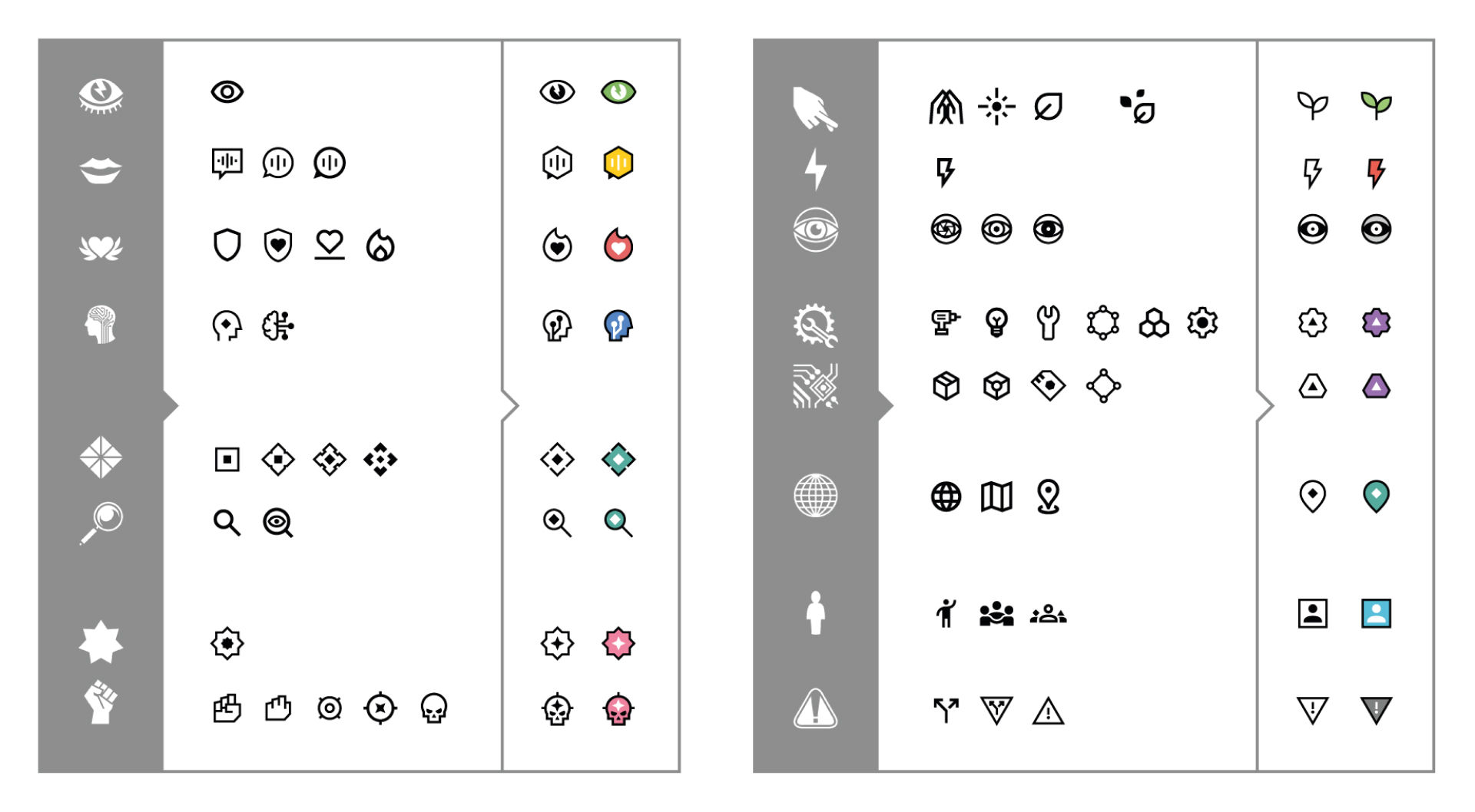
For texts and icons I took heavy inspiration from contemporary smartphone applications of which I have designed and developed several in the past. Realizing that proven solutions for keeping readability and clarity on limited smartphone screens could also be applied to playing cards.
All design elements are built on the idea of opposites. Combining straight lines and harsh angles with rounded corners and circles. Once again pointing at the contradictions at the core of the world we try to visualize.
Selecting an Art Style
Contrasting with the geometric shapes and flat coloring of texts, icons, layout elements, the illustrations are intentionally rough, organic, sometimes even messy. Highlighting one of the core conflicts in classical Cyberpunk: technology vs humanity.
The particular style we chose has an additional benefit: it is budget conscious and makes it easier to combine illustrations from different artists. The roughness of the illustration style also makes pieces of different artists appear more similar. Hiding differences in the clutter if you will.
We realised early on that the 300+ illustrations we needed for the final game are of wildly varying importance. From illustrations representing your character which follow you through the whole campaign to a generic door in an office building you see once for 5 minutes.
All cards need an illustration but will receive very different amounts of attention. Therefore an illustration style was needed that could scale in complexity while maintaining a similar level of perceived quality. A style that is a bit rougher by nature will have a way easier time blending between those ranges of complexity than a style that is highly polished.
Finding Artists
With a general idea of the required art style and our budget in mind we started searching through the web for weeks. Thankfully Dominik took on most of this special kind of treasure hunt, looking through Instagram, ArtStation, online forums and other art communities. Compiling a list of over 400 illustrators that might be relevant for our project.
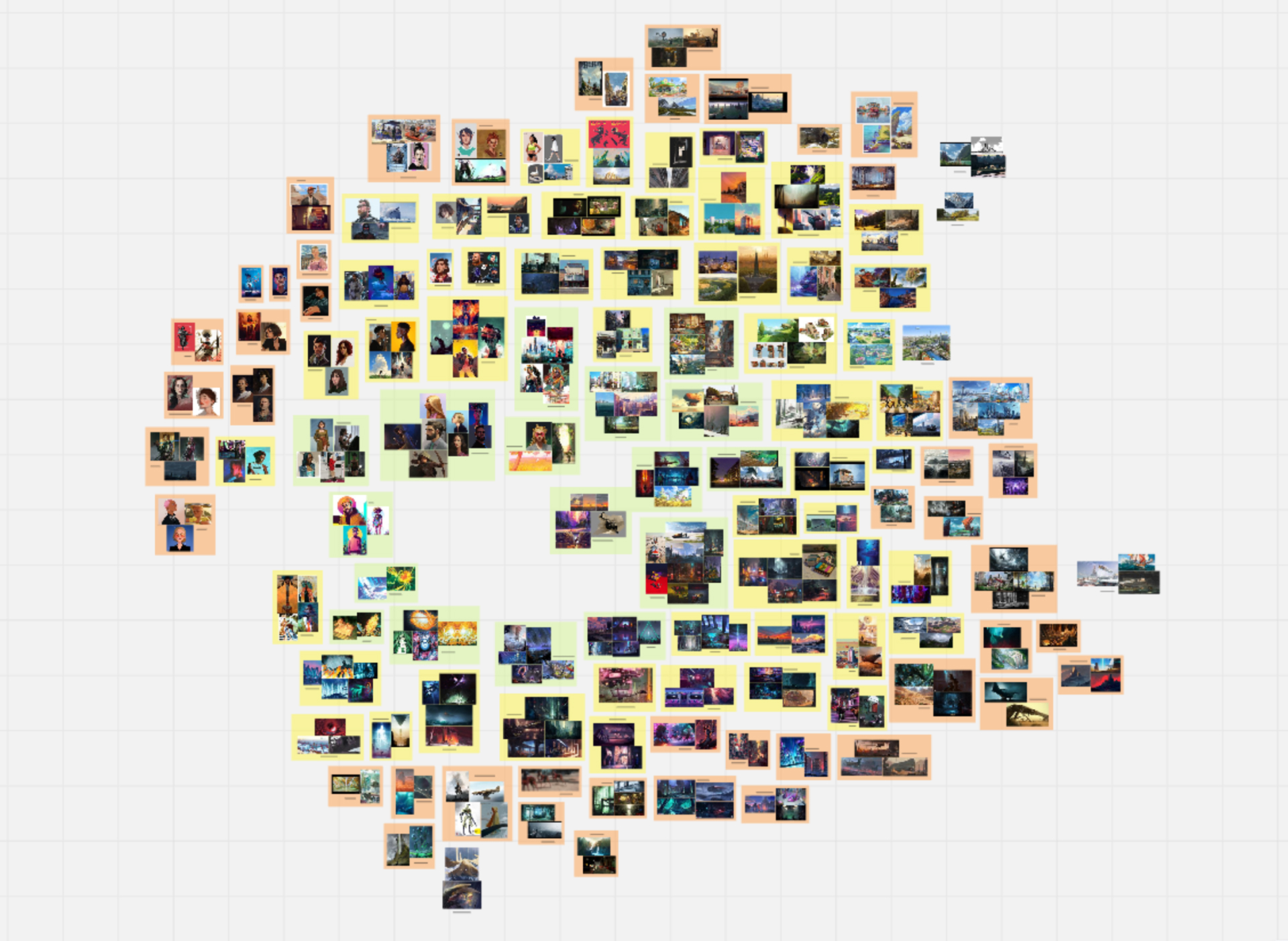
Going through all of them I selected around 120 from which I took fitting artworks and arranged those on a huge canvas. The position of their works on the canvas marking their assumed strong suit (characters, environments, abstract etc.) and their style fit in general (center/green = best fit).
We originally had planned to hire several illustrators to split the large amount of work. But after working with Robert Herzig on the first test illustrations we knew he was the one for the project. He created almost all illustrations for the marketing prototype and the Kickstarter Campaign and we are very happy to have him on board.
Fortunately Robert has also agreed to work with us for the whole project and we will continue this collaboration for future projects. Which allows us to ensure a consistent art style and quality throughout the world of NEON HOPE.
That’s it for now. Wishing you all a hopeful future!
